Creative Boom embraces a new era: Marking 15 years with a vibrant redesign
Today sees the launch of a refreshed identity for Creative Boom. The new look across our magazine, podcast and newsletter reflects our growing status and ambitions as we celebrate almost 15 years of supporting the creative industries.
It's been a whole year since we began chatting about Creative Boom and where it's heading. I sat down with our strategy, advertising, design and development teams in November 2022 and said, hey, we need a refresh, an evolution. Can we aim to get something live before 2024?
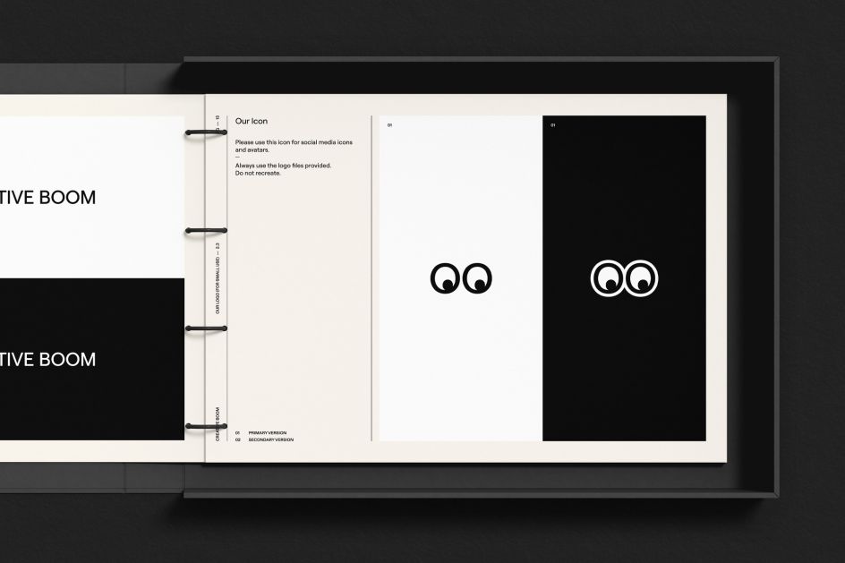
Why? It was in 2017 when we revealed our existing brand to the creative community. Designer Samantha Wilkinson was the mastermind behind the eyes icon. She developed the concept when we explained what Creative Boom was and hoped to be. And we wrote some code to make them move, following the curser around the website. It was our best decision, as it articulated our personality so simply and was warmly welcomed by the creative community.
It has done us proud. But that was over five years ago, so we booked ourselves in for the work, and after much discussion, research and planning, a new design began to unfold. We haven't deviated too far from what was there before. It's more about building on the existing identity. The friendly demeanour. The cheeky eyes. The feeling of warmth and empathy. It's a brand that doesn't take itself too seriously. It's approachable and inclusive, much like the platform, something we wanted to empathise through its tone of voice, wherever possible.
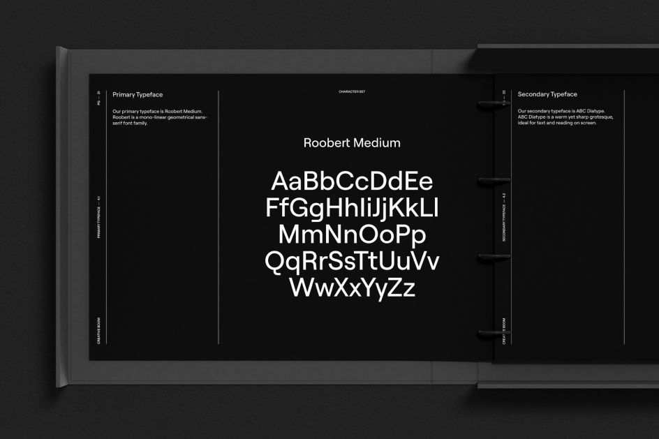
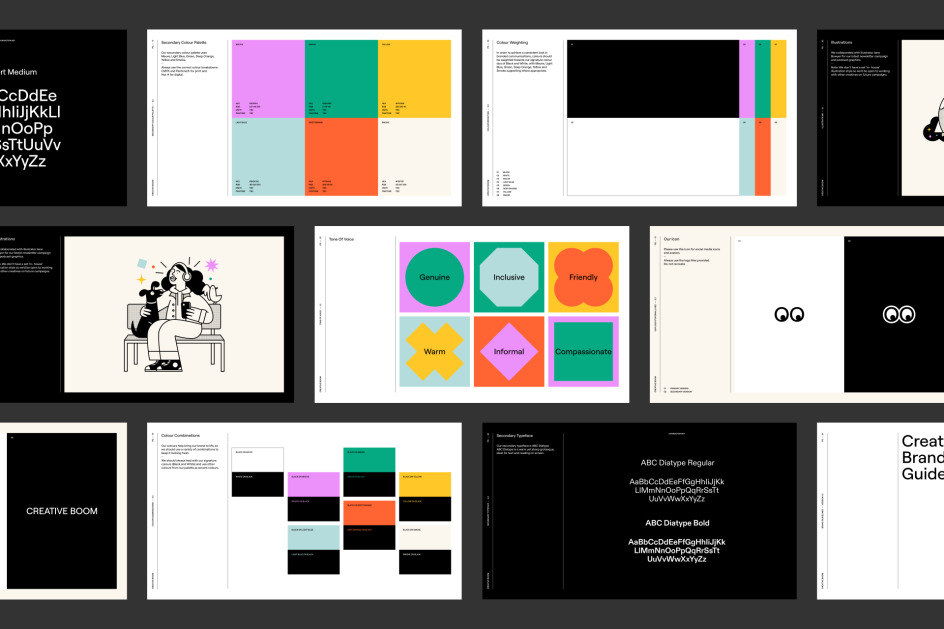
And so we refined our logo, changing the type ever so slightly to better reflect Creative Boom today. Our loveable eyes icon has been softened a little, with the Os becoming more rounded to evoke more personality and match the new typography. The logo and headings now use Displaay's Roobert, a mono-linear geometrical sans-serif font family that was initially designed in collaboration with Anymade Studio as a bespoke typeface for Moogfest 2017 – all derived from the Moog logotype. Body copy, meanwhile, remains in ABC Diatype, a warm yet sharp grotesque by Dinamo.
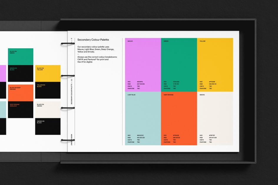
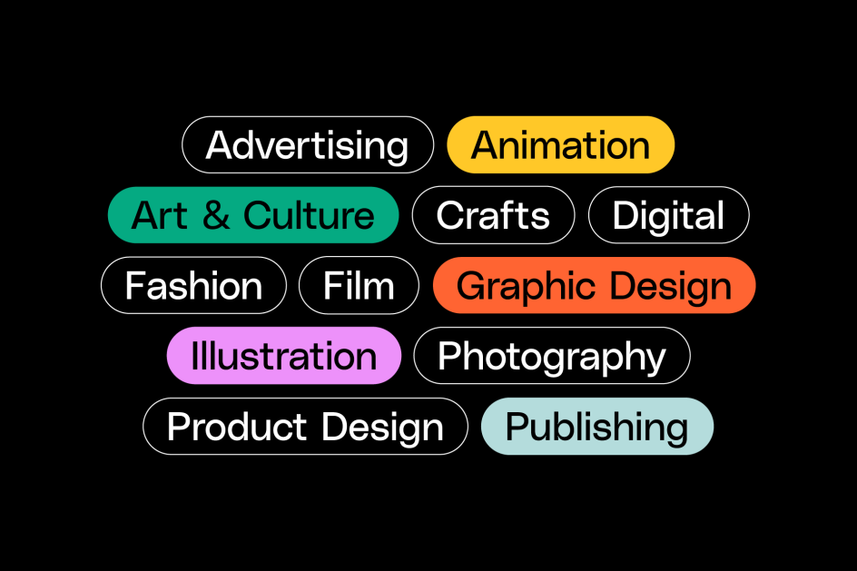
The colour palette is cheerful and vibrant yet grown up with mauve, deep orange, light blue, green, yellow and smoke, giving some energy and fun.
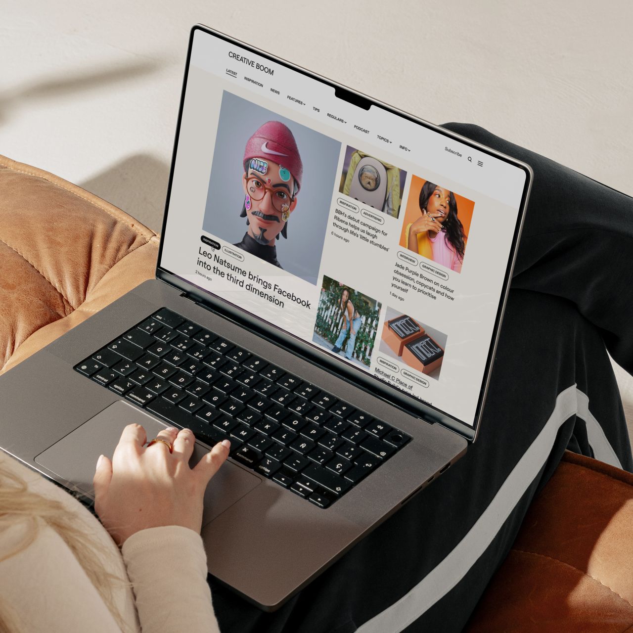
The website design is ultimately the biggest change. Layouts have more character. Type leads the way, and imagery rules, allowing the content to maintain the starring role. But muted background colours and various new formats and features help add a dash of interest throughout. It's playful without being too bombarding. It can't be; it's ultimately a magazine, and our stories remain the heroes of the day.
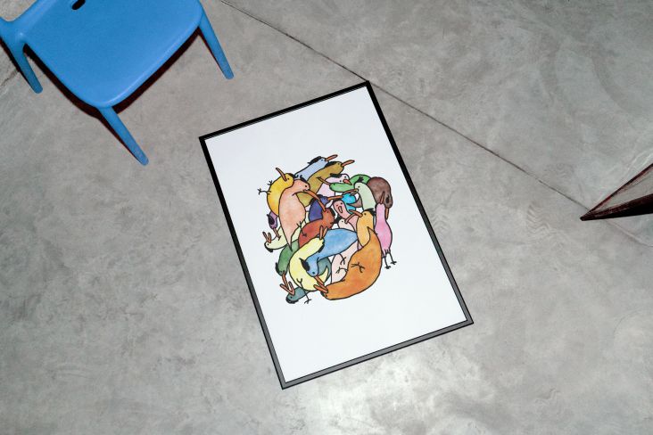
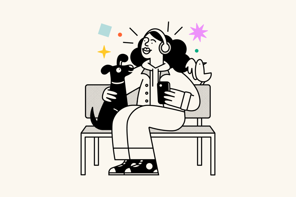
As part of the rebrand, a new series of illustrations has been introduced to Creative Boom to advertise our podcast and newsletter. The artworks feature characters, shapes and elements that depict the very audience our platform strives to support. The graphic designers and illustrators, the photographers and marketers – all these wonderful creative folk who love art and design. Jane Bowyer was the perfect artist for the job. She's established an illustrative theme that lifts our new identity and helps convey everything we love to write about and champion.
"It's been a joy to work on the illustrations for Creative Boom," says Jane. "The idea was to bring a touch of positivity and humour to characters finding creative inspiration in their daily experiences through its magazine, newsletter and podcast."
It's worth noting, however, that we don't have a set in-house illustration style, so we're open to working with other creatives on future campaigns.
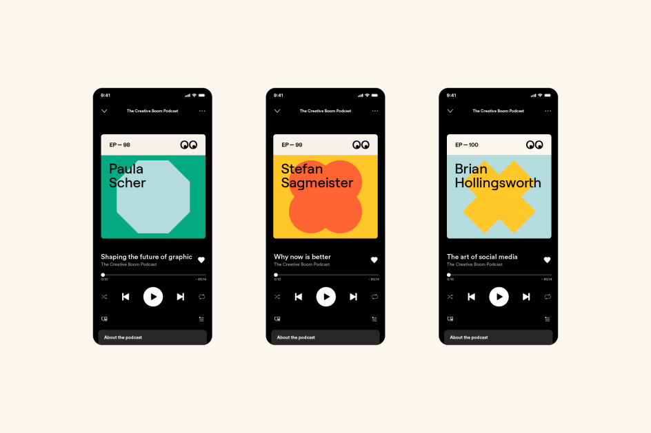
Our podcast has been overhauled, too, with a new show design and episode covers that move away from including portrait shots of guests to focus on type instead. Names are spelt out boldly and proudly in Displaay's Roobert, with abstract gentle shapes lifting each artwork, all in an array of the new brand colours.
The weekly newsletter, which reaches over 50,000 subscribers every Tuesday, matches the new web design and brings even more fresh content to people's inboxes. With a light and dark mode, the regular update features our highlights from the previous week, the latest podcast episode, plus recommended articles for reading elsewhere. It's a vibrant and happy newsletter that we hope sparks creative inspiration and motivation every week.
"Designing for a magazine is quite challenging," says Creative Director Andy Mallalieu. "You want to add personality without detracting from the content, which should be the real focus of the platform. It's about finding clever, subtle ways to let Creative Boom shine through, always keeping in mind its strong ethos of inclusivity. Type and colour certainly add fun, as do graphical elements dotted here and there. We also love the bespoke illustrations that add that cheeky charm we've all come to appreciate with the brand."
Andy adds: "Of course, the other difficulty was knowing we were designing something for other designers. That's always an anxious moment. But after many months of bringing it all together, we're really happy with the new direction and have loved working on the new Creative Boom. We've had plenty of time and breathing space to create something we're truly proud of."
The refreshed identity has been rolled out to other materials elsewhere, including invoices, media packs, forward feature lists, and more. Plus, our social media accounts have been updated, and you will see new branded content shared in the coming weeks.
Advertisers and supporters of Creative Boom will benefit from the refresh, too, with new opportunities opening up across the platform to help reach our creative audience. Jon Everall, partnerships director, says: "It's a timely fresh update, reflecting our growing status and ambitions. We wanted to be able to offer more to our audience and partners, and this beautiful format will help us do so."
It's a big day for us. A year in the making. We hope you enjoy browsing around the new Creative Boom, which will continue to see updates introduced in the coming weeks and months. Hey, it's a big platform these days. And so there will inevitably be things that need addressing and ironing out. If you spot anything, please do let us know. And if you've got time, we'd love to hear your thoughts.
Today is also a moment of reflection. We're proud that Creative Boom has become a friendly face of the creative industries over the last 15 years. We've strived to make it like a kind and positive pal who is always there, guiding you in your creative endeavours and making you feel like you're part of a supportive community. Long may our mission continue to celebrate, inspire and support creatives everywhere. Boom!
Editor's Picks


Trending


](https://www.creativeboom.com/upload/articles/86/862919952c0ad18439004228895a431dc6e45ffc_732.jpg)
Podcasts


Editor's Picks
Further Reading